Carousel
Author Image
I went to Walgreens last night for Easter candy. Their Loreal nail polish was on sale, 2 for $5. I picked up some bright colored ones, but ended up buying a rose and a lilac. Now I wish I’d bought the brighter color ones. I never can remember what colors I already have, though.
We did pictures yesterday, since GH pictures are due to RWA on Monday and my picture last year was so PALE. The third picture I took I liked pretty well, and I didn’t even have to touch up much, but the dh said I need a new image. He thinks authors shouldn’t look like regular people, and he thinks I’m wrong for taking pictures in the back yard. (Never mind we had a 2 week turnaround this year, and I’ve become Queen Procrastinator.) He said that considering the books I write, I need to tailor my persona, both visually and online, as someone who writes action adventure instead of being a Regular Person.
Here’s the deal – I can’t be someone I’m not. Even in pictures.
So I went to look at different author pictures. Nora has two different pictures for her pen names, which is cool, and fitting. 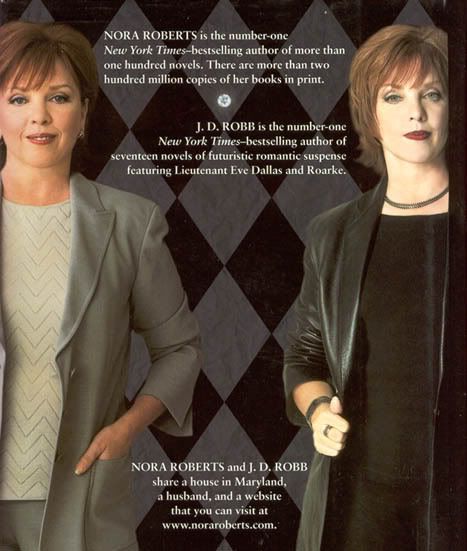
Colleen Gleason looks like the books she writes.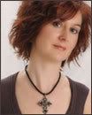
So does Joanna Moore.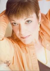
Sherrilyn Kenyon is probably the best example.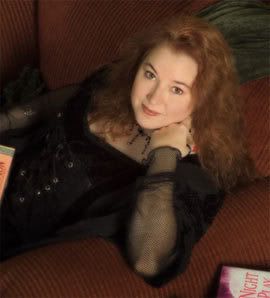
So is Laurel K. Hamilton.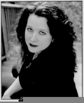
And Allison Brennan.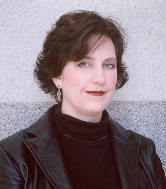
And Lori Handeland.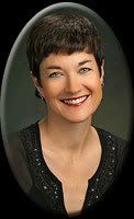
And Joanne Rock.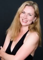
J.R. Ward looks like a regular person (my dh’s words – not that she looks boring, or that the others don’t look normal or anything – she just doesn’t look like she writes dark paranormal.)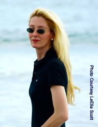
So does Susan Wiggs (I really like both these pictures.)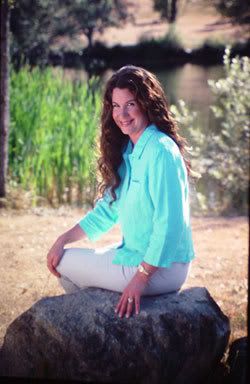
But the women who write what I write look like regular folks.
Cindy Gerard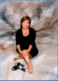
Cherry Adair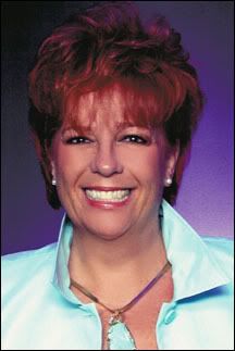
Catherine Mann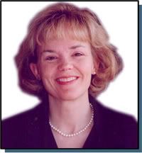
Virginia Kantra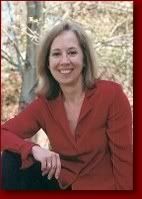
Diana Duncan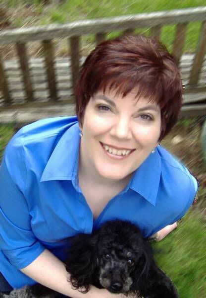
Suzanne Brockmann 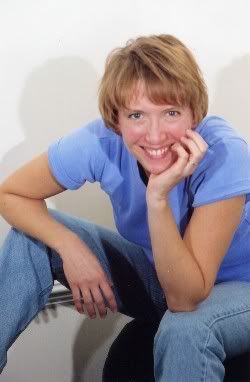
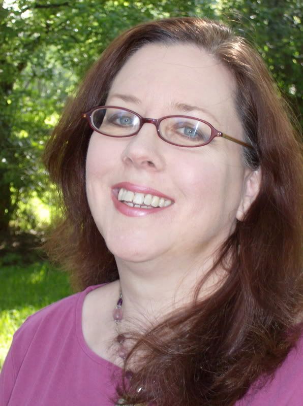
So here are the two pictures I came up with for my picture. Last year’s picture was so washed out.
Which do you like?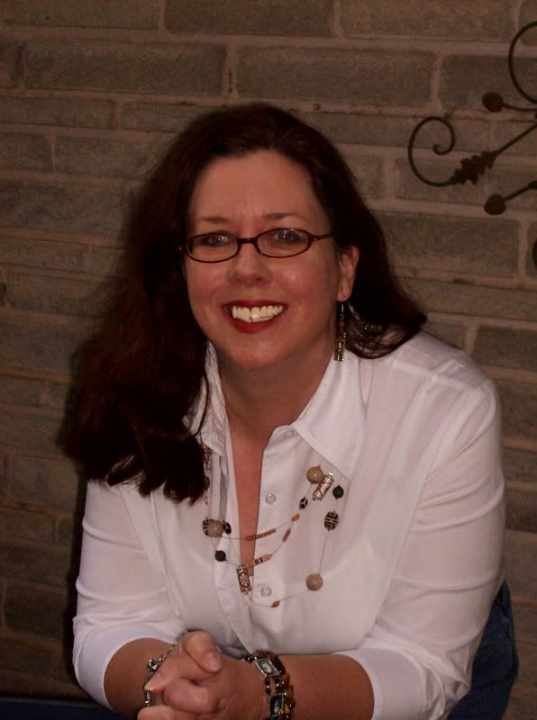

6:04 AM
|
Labels:
pictures
|
Goodreads
Followers
About Me
- MJFredrick
- I'm a mom, a wife, a teacher and a writer. I have five cats and a dog to keep me company. I love bookstores and libraries and Netflix - movies are my greatest weakness.
Archive
-
▼
2007
(370)
-
▼
April
(26)
- This Week in TV
- Conversations with Men
- Carpe Diem
- Hours in the Day
- Stuff
- Too Many Stories
- Things I'm Looking Forward To...And a Few I'm Not
- We will sell no wine....and JDM
- Princess Mary
- Supernatural Squee!!!
- 7 Pages
- Contests and The Ghosts
- My Terrifying TBR
- Aches and AC
- Running Hot and Cold
- Tourist Day with Chris
- Old Books
- Things That Make You Go EWWWW!
- Old Crushes and Talents I Wish I Had
- Happy Easter, and World Building
- Author Image
- Broken Brother
- TV and Writing
- Dreams and Reading
- Weekends
- FINISHED!
-
▼
April
(26)
Carina Press
Twitter Updates
Join My Newsletter
Where Visitors Live
MJ Fredrick Fan Page's Fan Box
- Amazon
- American Title
- anticipation
- balance
- Battlestar Galactica
- birthday
- bodyguard
- book review
- books
- booksigning
- Breaking Daylight
- brother
- buckets of crazy
- charms
- Christmas
- Cindi
- cleaning
- collage
- computer woes
- conference
- contest
- contests
- contract
- Crocs
- dh
- Don't Look Back
- dreams
- e-books
- Easter
- excerpt
- exercise
- family
- food
- Friday Night Lights
- funny
- GH
- Gilmore Girls
- goal
- goals
- Golden Heart
- good news
- Grey's Anatomy
- guest blogger
- hair
- Halloween
- heroes
- Hillary
- Hot Shot
- inspiration
- JDM
- kitties
- Lost
- meme
- Men in Trees
- MIL
- Mother's Day
- movies
- music
- names
- Nano
- NCIS
- Nora Roberts
- obsessing
- OUCH
- pictures
- plotting
- promo
- promotion
- PS I Love You
- rain
- reading
- recipe
- rejection
- release day
- request
- review
- reviews
- revising
- revisions
- Rita
- Ritas
- rodeo
- romance
- Samhain
- SARA
- school
- shopping
- shout outs
- sick
- sleep
- small town story
- Smoke
- SOLD
- Spurs
- stress
- submissions
- summer
- Supernatural
- Surface
- title
- top ten
- Trish
- TV
- vacation
- Veronica Mars
- Vista Print
- Watchmen
- Wayback
- wet noodle posse
- Wild Rose Press
- workshop
- worrying
- writing






14 comments:
Mary I love 'em both. I like the lighting on the top one but I also like the bottom one because of your smile.
So if I had to choose? The bottom one. I feel that it's you.
I agree...I like the second one. It's just you.
You think my picture fits my writing? Does it look...mysterious? :) Gads, I hope so... :)
Love you, Mar.
J
They're both great pics. I like both, but I think the second is probably your best bet. Like Michele said, the smile is great!
(But I do like your necklace and the white shirt/jeans combo in the first one!)
I actually like the first one (I have to be different), but wish it wasn't quite so dim... I love the outfit, the pose, everything... except the lighting.
OTOH, the second one is nice, too. I don't think you can lose either way!
Okay, you know I like the second one because it looks like you and you have a great smile in that one, but after considering what you write and how we want to project professional images in regards to what we write, I think I'm leaning toward the first one. It's still casual, but in a professional, authorly way. The second one is good, but more casual. Someone mentioned this whole "make your picture reflect what you write" idea to me, and that's why I went with a more fun, casual shot this year -- because I finaled in YA, not romantic suspense. I would have probably gone with the other picture I was considering if I'd finaled in RS.
Aren't author photos hard? Sheesh.
My vote is for the second one. But the first one is also good so you could go with either.
I like them both too. Because of lighting and how they show the photos on the big screen at the ceremony, I like the first one best. :-)
The second one is fine, but to me, it says, "Here's my author photo."
The first one says, "Hey, nice to see you, come on over here and let me share this awesome adventure I wrote!" It invites the reader into the partnership.
Does that make any sense?
I really like the second one.
Now with all these, I'm wondering if I should get a an author photo. Trish Milburn snapped my picture at an RWA booksigning, and I just use that one. And I didn't even give her a photo credit.
They're both lovely, but I like the second one :)
I really liked the first one. I like the pose and the outfit and the style.
BUT the bottom one had less photographic issues, so I went with that one. I couldn't get rid of the red-eye in the top one, my hair looks frizzy, it was getting dark, and I went a little crazy with Photoshop on the teeth ;)
Interesting that some of you said the second one is "me." That's the first thing Trish said when I sent it to her!
JoAnn, I think your picture is....not whimsical,
because that's not what you write, but you look like your heroines feel. I know that doesn't make sense.
Natalie, I agree with what you're saying. I think if I DIDN'T have the second one, I'd be really happy with the first one. But I'm kind of tickled that I didn't have to touch up the second one at all.
happy Easter, miz mary.
i can't see the second shot of you for some reason
but i love the first one.
if you ever want to come down here one evening when the sun is setting (perfect light), i can shoot some more shots of you so you can have even more choices.
nora looks like pat benatar.
Dawn, I thought about you taking my picture before I finalled, but then I got the timeline and it was tight, and we've had such nasty weather! Thanks for the author!
Urgh, I mean the OFFER, not author!
Post a Comment